Teacher Name: Elizabeth Drake
Grade: 9
Dimensions: 9” × 12”
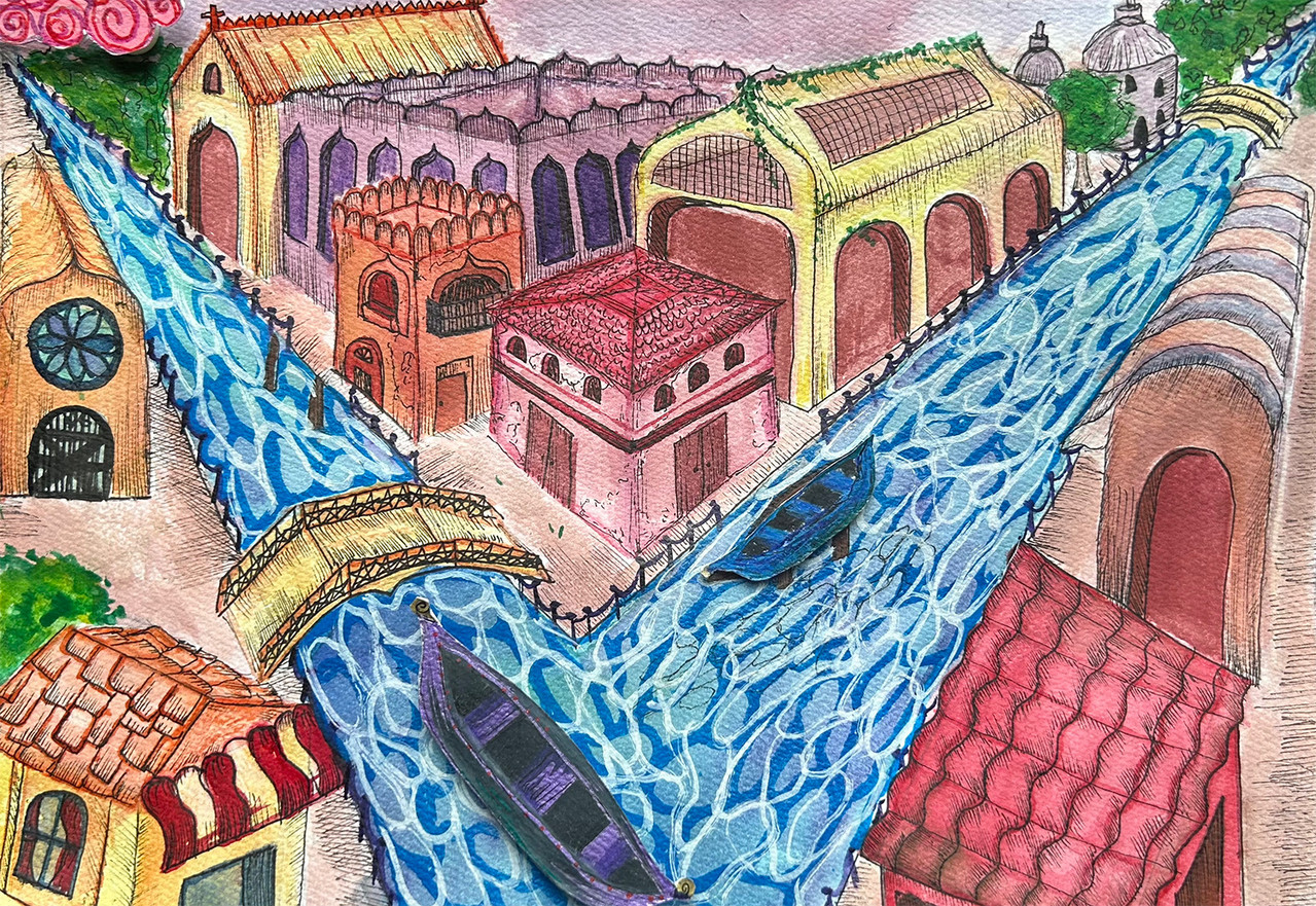
Artist Statement: When I started this project, I immediately thought of Venice in Italy, not just because it’s a beautiful city but also because of the fantastic water roads. I wanted to create something that would stand out, but you could identify what it was and where it was. My piece is called “Golden hour in Venice.” My painting consists of a pink and warm colored city with detailed architecture and little town buildings and houses full of different textures and designs with vines and nature growing on the old buildings and then a deep, bright blue river going through the city. The elements of art I used the most were color, value, and texture to make the picture as accurate as possible, adding a lot of consistency with the buildings and town but using a dreamy color pallet and thinking about which color I’m using and how I make value. The principles I tried my hardest to show in my art are contrast by making all the buildings and land warm colors and then using cool colors for nature in the artwork, like the plants and water. The other principle I tried to execute is a movement with the water pattern to make it seem free-flowing. The media of my artwork is mixed media. I started with painting all the base colors of the buildings and water with watercolor painting. I started doing gradient washes with the facilities and a variegated wash with the water. I played with the watercolor paints until I was happy with the result. I wanted a colorful consequence of the building with warm colors, so different variations of pink, red, orange, and yellow. Then I went in with a micron pen and added the tiny details I wanted to put to show old architecture that is in Europe. I also made shadows by cross-hatching with the pen .nce was happy with how much detail there was; I took metallic paint pens to add tiny details to the boats and buildings to add an artistic and somewhat dreamy result. In my artwork, I wanted to envision the architecture of Europe with very tiny details the buildings have. I tried to have my artwork have art within itself. I wanted to give a message to appreciate the beauty a moment can bring, and you only have one chance to save that beauty; otherwise, it is gone. I wanted to give a feeling of serenity and dreaminess, and I think I did that by using warm pastel colors for the city and bright, vibrant cool colors for the nature of the painting. I wanted to give the people that were looking at my painting a feeling of safety and serenity and feel almost as if they were looking in a dream with the warm, soft colors of the town and vibrant colors of nature, trying to make it seem as if it was a perfect moment frozen in time. I also wanted to give as much detail in the buildings as I could to make the painting feel realistic. Usually, dreamy and practical don’t go together, but my goal was to mix those two elements to get a picture that gives you mixed feelings. I learned that color could have a massive impact on what feeling your art