Teacher Name: Alexandra Coffee
Grade: 12
Materials: Alcohol markers
Dimensions: 8.5” x 14”
Artist Statement: I chose the graphic novel titled “Erase una vez y otras mentiras” because it appealed to me and seemed interesting. I also liked the fact that it’s in Spanish because I mainly just read things that are in English so it was nice to switch up the language. The actual drawings in the novel also amused me because I thought they were well-drawn and very detailed.
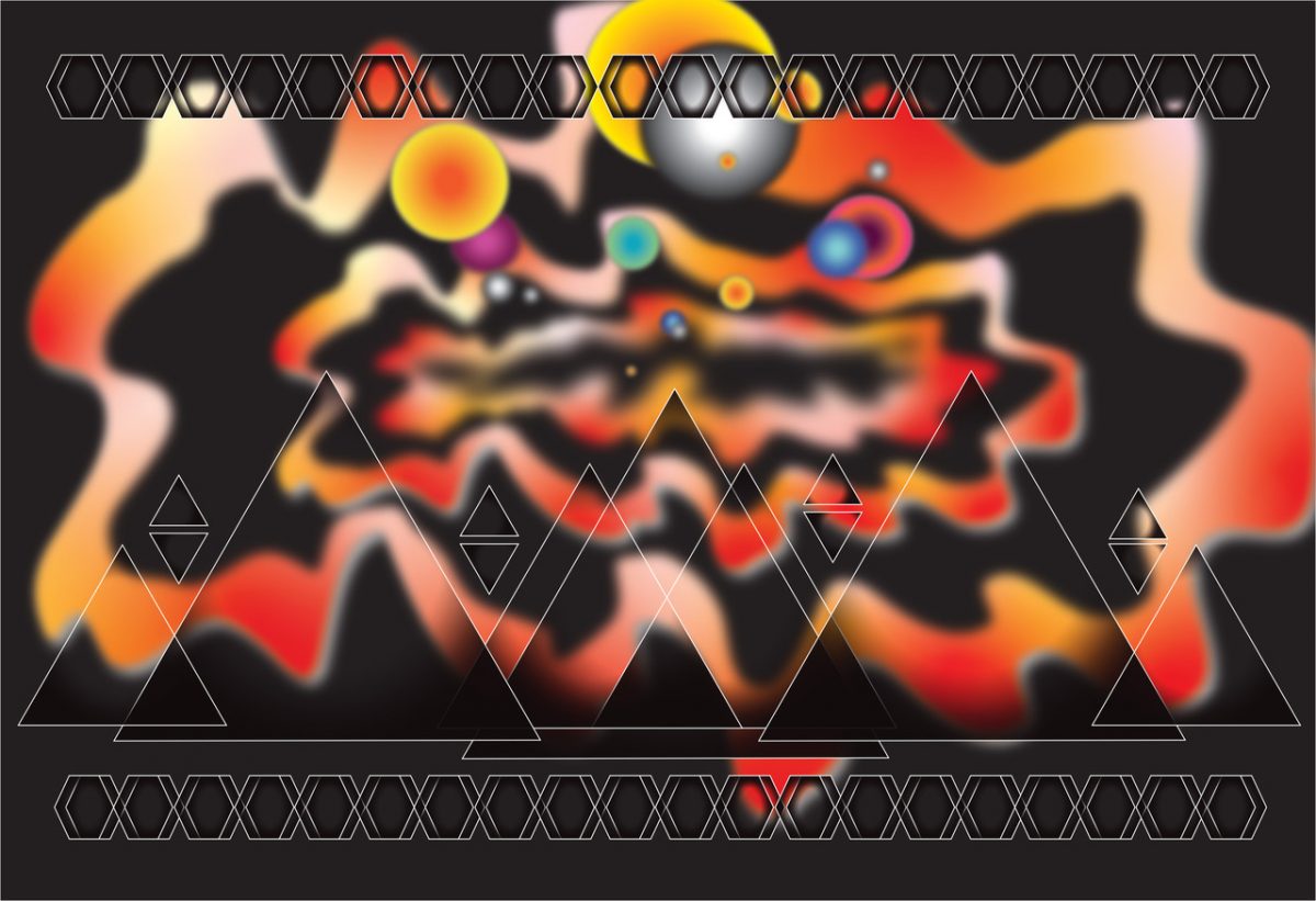
I chose the new cover design because I felt that the cover it currently has didn’t give me a preview of what the book is about. When I first saw the book I didn’t understand what it was about and it wasn’t until I started reading the book that I understood it. It also seemed like a fun idea for me to be able to create a new cover book with the intent to include some ideas that I found while reading.
Something I would’ve done differently is to not spend as much time planning. I think I spent too much time planning and trying to organize it a certain way that I ended up not having enough time to finish. The best thing I could have done was to make a plan and then just start executing it because it all just started coming together once I started the project.
One aspect of the work that I think is successful is the little changes I made to the cover that helped convey what the story was about. For example, I changed the title from “Erase una vez y otras mentiras” to “Erase una ves en mundos cambiantes” because to me the “mundos cambiantes” was a huge part of the storyline. I also added some objects to the cover that were found throughout the story that also represent some major plots of the story.


